
Why Blue Artwork Elevates Interior Design: An Expert Guide
Blue artwork has long been a cornerstone of refined interiors, and for good reason. It carries a unique ability to balance emotion and structure—bringing both calm and visual depth into a space. Whether you’re designing a modern living room or a classic, moulded interior, a blue painting can act as the defining element that ties everything together.
The Psychology Behind Blue in Interiors
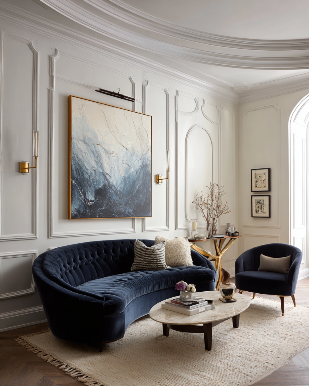
Blue is universally associated with calm, stability, and clarity. In interior design, it functions as a visual pause—softening busy compositions while still adding presence. Lighter tones, reminiscent of sky and water, create an airy, expansive feel, while deeper navy and indigo shades introduce richness and sophistication.
Unlike warmer accent colours that energize a space, blue grounds it. This makes it especially powerful in living rooms, bedrooms, and transitional spaces where a sense of ease is essential.
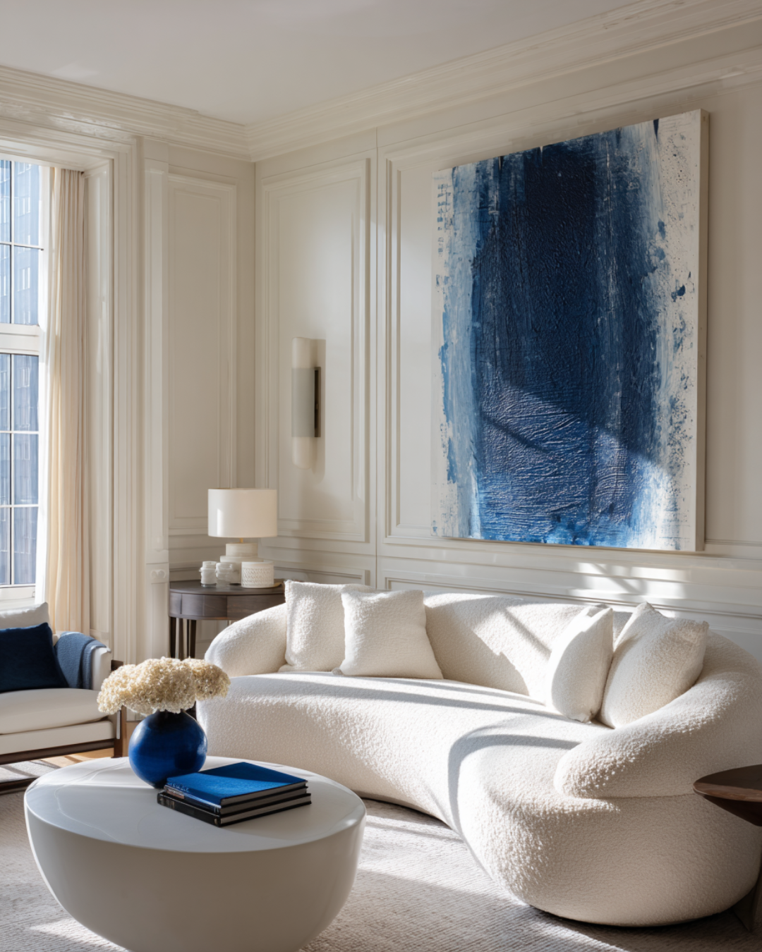
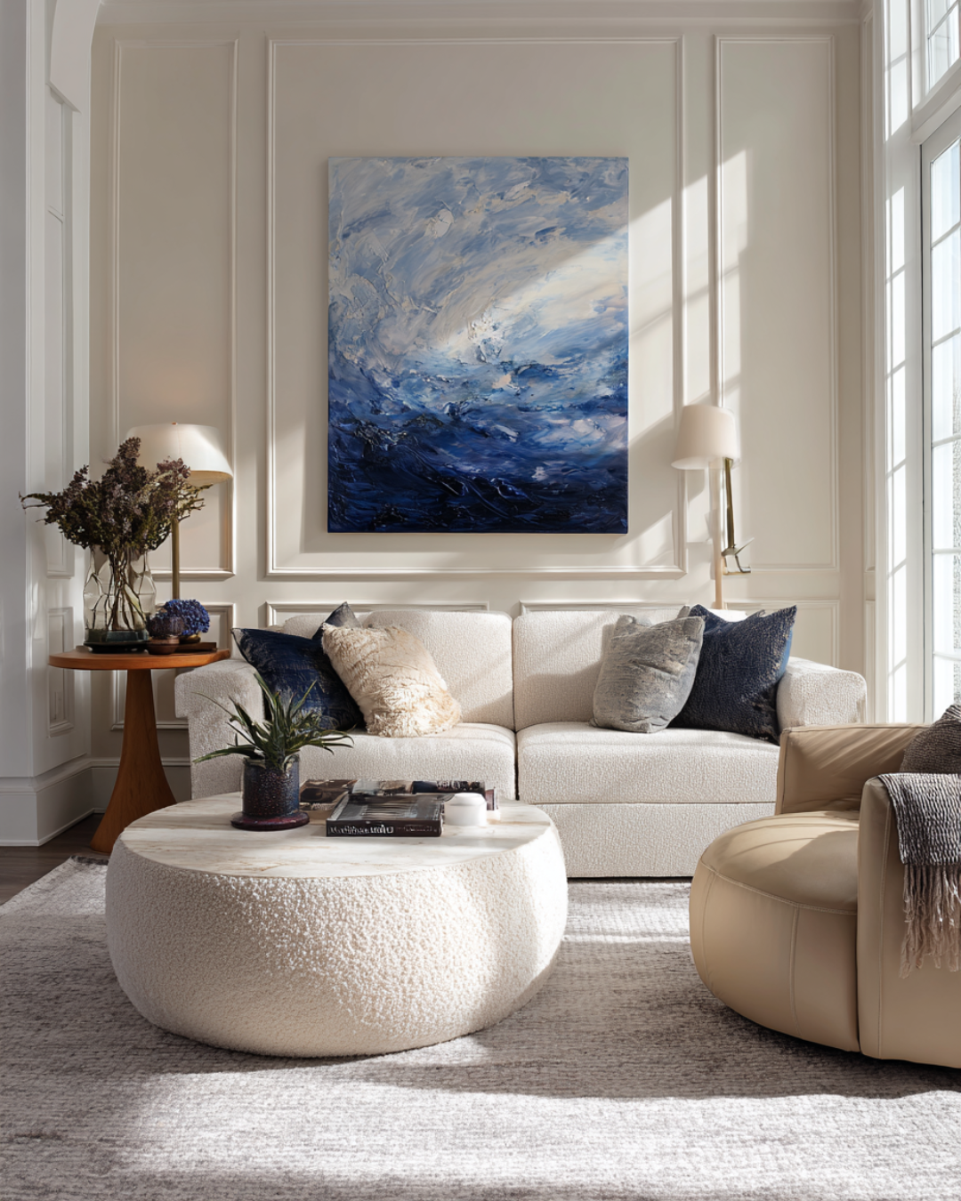
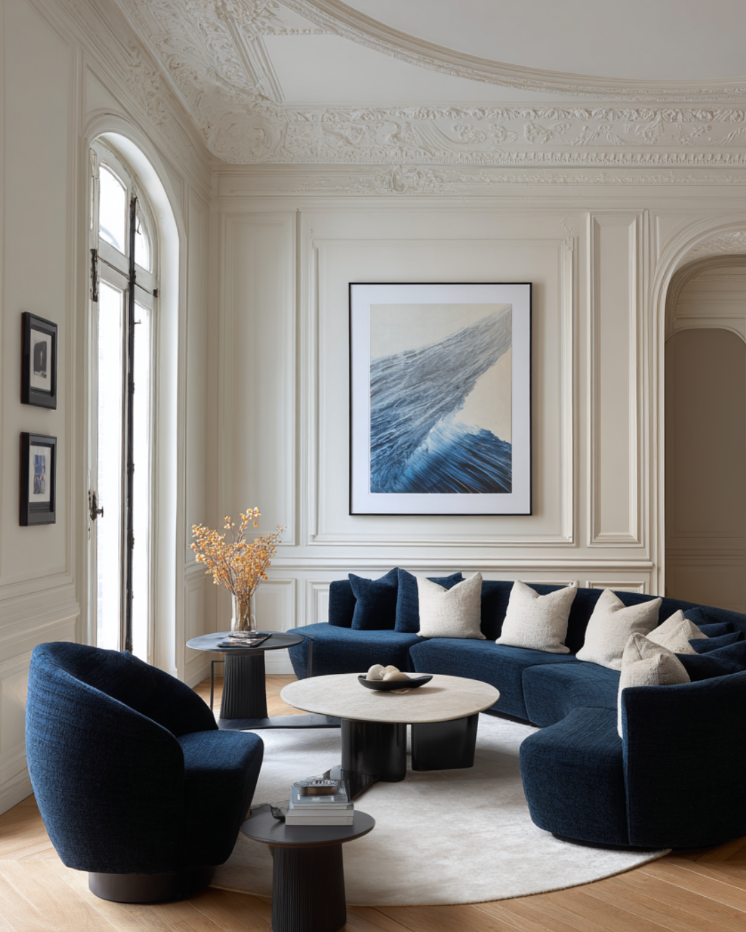
Blue as a Focal Point
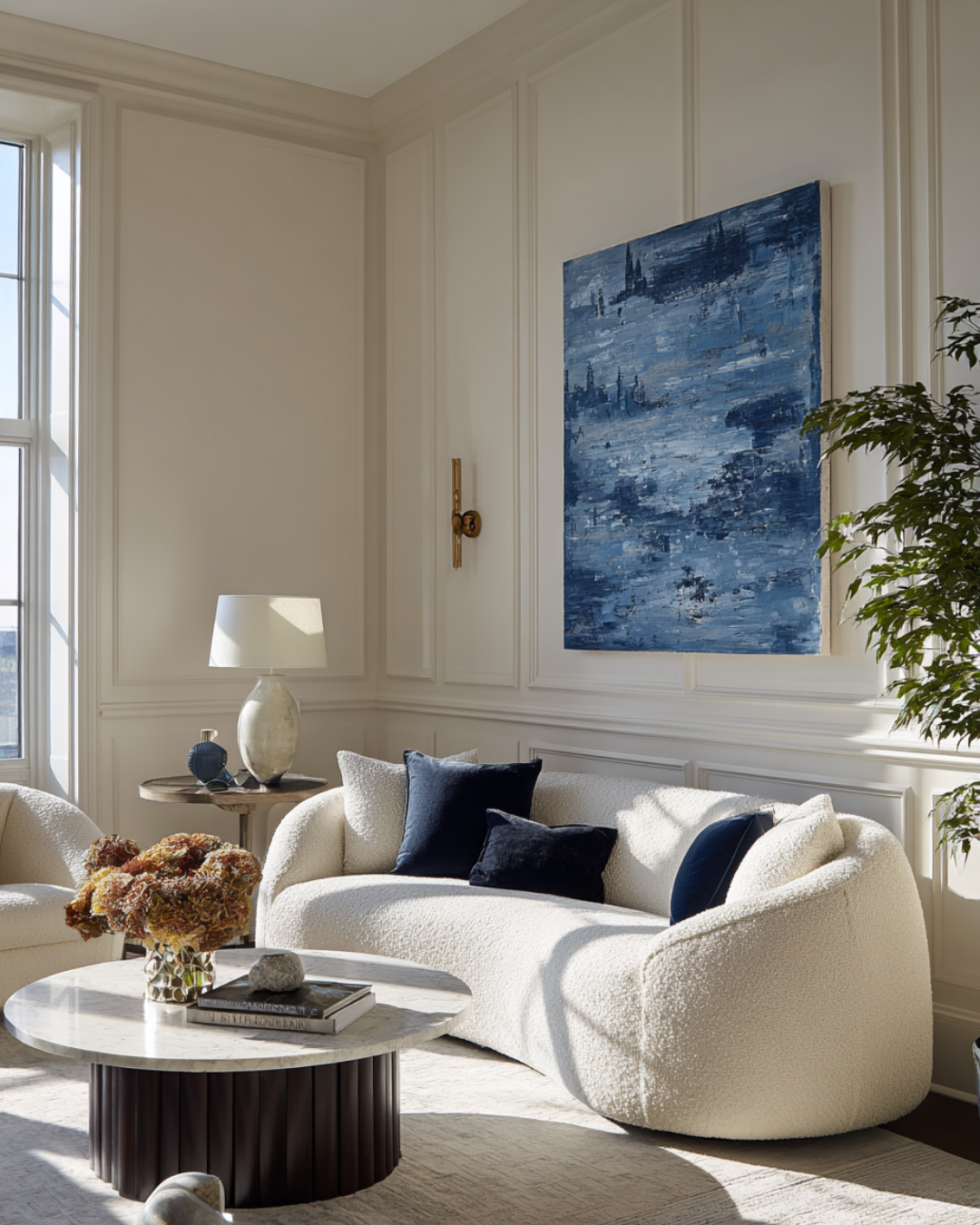
A well-placed blue painting naturally becomes the focal point of a room. In neutral interiors—think creams, ivories, and soft beiges—it introduces contrast without overwhelming the palette. The eye is drawn to the artwork, allowing it to anchor the surrounding furniture and décor.
Large-scale pieces are particularly effective. They not only fill vertical space but also create a gallery-like atmosphere, elevating the entire room from styled to curated.
Pairing Blue with Materials and Textures
The true impact of blue artwork lies in how it interacts with surrounding elements:
Warm neutrals (linen, boucle, wool) soften the coolness of blue and create balance
Natural wood adds warmth and organic texture, preventing the space from feeling too crisp
Stone and marble enhance the refined, timeless quality of blue tones
Metal accents (brass or gold) introduce a subtle contrast and elevate the overall look
Texture is key. A heavily layered or abstract blue painting pairs beautifully with tactile fabrics and sculptural furniture, creating depth beyond colour alone.
Light and Placement Considerations
Lighting plays a crucial role in how blue is perceived. Natural light enhances its vibrancy, revealing undertones that shift throughout the day. In contrast, artificial lighting—especially warm lighting—can soften deeper blues, making them feel more intimate.
Placement matters just as much. Positioning artwork at eye level above a sofa or console ensures it integrates seamlessly into the room’s composition. In more architectural interiors with mouldings or paneling, aligning the artwork within these frames creates a cohesive, intentional look.
Styling for a Cohesive Look
To achieve a designer-level finish, echo the tones of the artwork subtly throughout the space. This doesn’t mean matching everything exactly—but rather repeating hints of blue in cushions, vases, or decorative objects.
The key is restraint. Blue artwork should lead the composition, not compete with it.
Final Thoughts
Blue artwork is more than decoration—it’s a strategic design choice. It introduces emotion, defines space, and elevates interiors with minimal effort. When thoughtfully styled, it transforms a room into something that feels both serene and sophisticated.
If you’re looking to create a timeless interior with depth and presence, start with blue.
By Home & Silence Magazine